
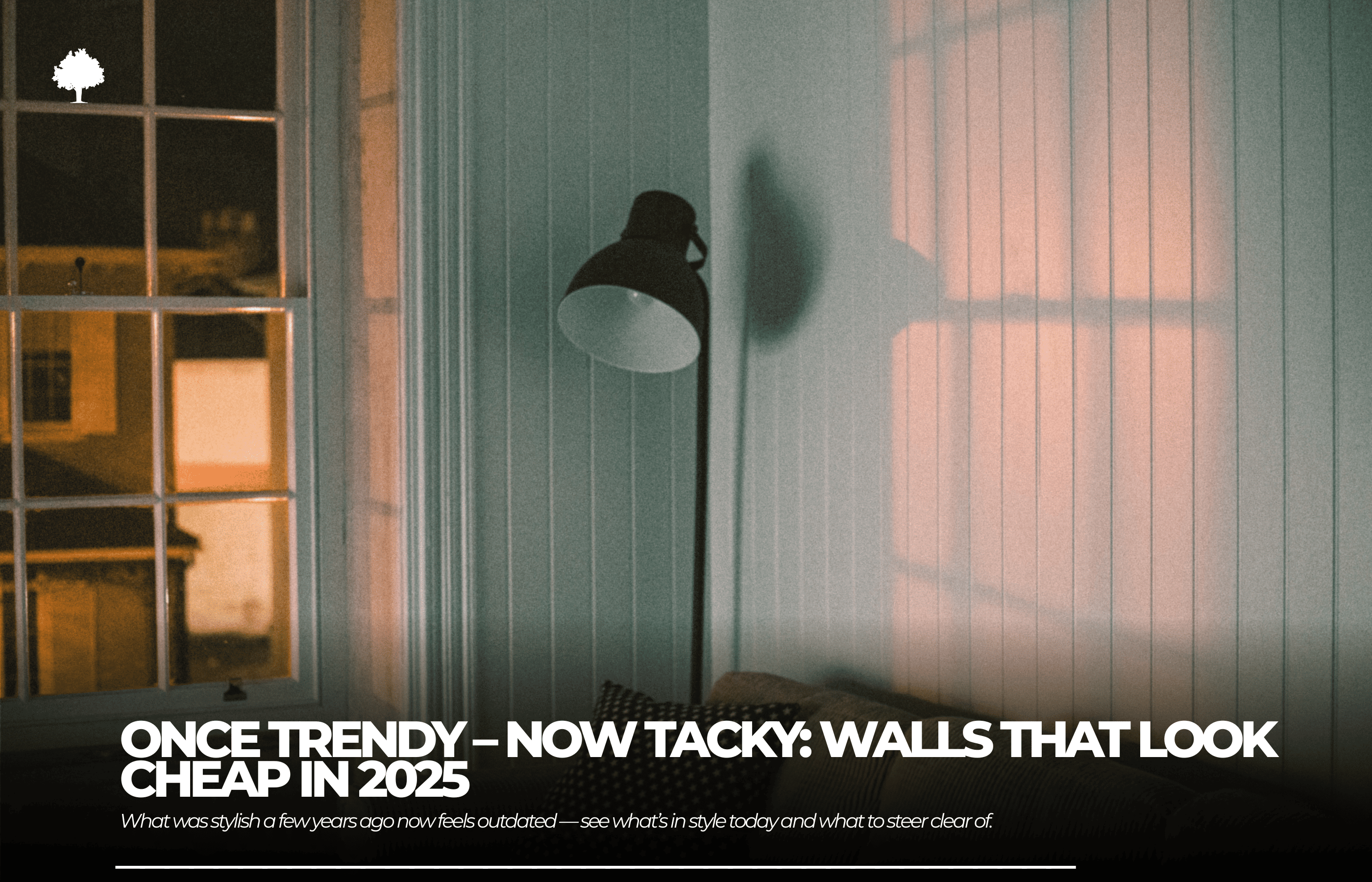
.png)

Not so long ago, these elements were considered the height of modern style — bold, trendy, and indicative of a confident approach to interior design. Today, however, they more often provoke discomfort, a sense of excess, or simply… aesthetic dissonance. We’re talking about wall trends that once filled interior design catalogues and makeover shows, but are now regarded as symbols of questionable taste.
In this article, we explore why some trends lost their charm so quickly and what is genuinely considered stylish in 2025.
Table of Contents
1. Introduction
2. Why did some trends age so quickly?
3. Colours that look tacky in 2025
4. Motifs and patterns considered kitschy
5. Why are we moving away from imitation?
6. Wall trends 2025
7. Natural cork
8. Summary
9. FAQ
Why did some trends age so quickly?
What counts as “tacky” in 2025?
Interior design evolves just as fast as the fashion world. What separates short-lived décor mistakes from truly timeless solutions is not only visual appeal — it’s also how they are perceived socially, the quality behind them, and the shifting expectations of users. In 2025, something is considered tacky when it is:
-
exaggerated and unnatural,
-
too visually intense,
-
poorly crafted or made from low-grade materials,
-
devoid of authenticity.
Today’s design preferences skew toward natural textures, harmonious compositions, and understated elements. Excessive shine, visual overload, and stylistic pretence are more and more often perceived as indicators of poor taste.
Wall trends of the past that now feel awkward
Here are several once-popular interior choices that now tend to make design-savvy homeowners and professionals cringe:
1. High-gloss 3D wall panels
Originally meant to bring a modern, dynamic touch to interiors, these panels are now seen as overly aggressive visually. Their intense shine, sharp forms, and exaggerated patterns overwhelm a room and add a sense of disorder — especially when used on full walls. Within today’s design language, they feel simply exhausting.
2. Plastic panels mimicking brick or stone
Plastic “brick” panels — especially in white or red — once dominated quick, budget interiors. Today, they are associated with cheap, temporary fixes that lack character. Their synthetic feel is unmistakable, undermining the authenticity of the room.
3. Lacquered ’90s wall cladding
Highly glossy, often in honey or brown wood tones, this cladding dominated homes for decades. Today, however, it is widely viewed as a dated leftover from another era. Even its nostalgic charm cannot prevent it from being labelled a décor faux pas — instead of timeless style, it evokes memories of heavy, stuffy interiors.
4. Low-quality vinyl cladding
Vinyl panels with artificial textures and visibly synthetic patterns lose their appeal quickly — both in appearance and durability. Scratches, peeling, and poor resilience make them a clear example of cutting corners at the expense of long-term satisfaction.
5. Photo wallpapers with random imagery
Wall murals featuring landscapes, bridges, or waterfalls — often in low resolution and with clashing colours — were once meant to add energy to a room. Today, they are considered kitschy, juvenile, and disconnected from modern design trends. It’s one of the quickest ways to make a space feel outdated by a decade.
Colours that appear outdated in 2025
The colours used in an interior strongly influence the way a space is perceived. In 2025, we see a clear shift toward muted, nature-inspired hues that promote a sense of calm and comfort. Within this framework, some colours — once trendy and widely used — now feel overly intense, artificial, or simply unpleasant to look at. Below is a palette worth avoiding if you want your home to reflect today’s design sensibilities.
Neon and overly vivid tones
Bright yellows, lime greens, hot pinks, and electric turquoise once served as eye-catching boosts of energy. Yet when used extensively, they quickly became overwhelming. In 2025, neon tones are associated with excess and poorly considered design choices. Applied on walls — especially throughout an entire room — they dominate the space, introduce visual chaos, and disturb the interior’s sense of balance. They work far better as small accents rather than wall-to-wall solutions.
White that is too cold
Although white remains a classic choice, its undertone has a huge impact on the final effect. A cold, laboratory-bright white paired with harsh LED lighting creates a feeling of sterility, emptiness, and impersonality. Instead of looking fresh, it makes the interior feel clinical. Current trends favour warmer, creamier whites or softened neutrals that feel more natural and welcoming.
Glossy metallics used on large surfaces
Gold, silver, and copper can look stylish when applied sparingly. However, when entire walls, wallpapers, or panels are coated in metallic finishes, the result becomes overpowering and ostentatious. In 2025, such large-scale metallic sheen is often interpreted as prioritising spectacle over substance — too flashy, too synthetic, simply too tacky. Modern interiors thrive on subtle detail, not on surfaces that resemble a jewellery display.
Motifs and patterns seen as kitschy
Patterns can infuse a room with personality, break uniformity, and elevate the décor. Problems arise when they are poorly selected, overly dominant, or completely disconnected from present-day design trends. In 2025, the emphasis is on moderation, subtle references to nature, and balanced compositions — while exaggerated patterns are viewed as stylistic relics.
Extra-large floral designs
Massive flowers stretching across an entire wall were once intended to make a bold decorative statement. Yet their oversized scale and saturated colours soon felt overwhelming. Instead of adding romantic or natural charm, they create a theatrical and heavy atmosphere. In small rooms, they visually reduce the space; in larger ones, they dominate the scene. Delicate botanical motifs in soft, muted hues are now a far more refined choice.
Marble imitations in unnatural shades
Marble is synonymous with elegance, but only when its appearance remains true to nature. Attempts to “modernise” it using colours such as purple, blue, or fluorescent green lead to results that stray far from good taste. These prints — often found on tiles or wallpapers — introduce artificiality and visual clutter rather than refinement.
Animal prints on a massive scale
Leopard, zebra, and tiger patterns — borrowed from the world of fashion — also made their way onto walls. Unfortunately, when enlarged and applied over large surfaces, they appear exaggerated and border on caricature.
Why are we turning away from imitation?
For many years, imitation materials were a fast and inexpensive way to achieve a “wow” effect indoors. Plastic brick posing as a loft wall, vinyl wallpaper imitating wood, or 3D marble-style panels all aimed to recreate a desired aesthetic without the associated expense. However, growing aesthetic awareness and increased ecological consciousness have made these shortcuts far less acceptable. In 2025, what matters is not only how something looks but also what it is made of, how it ages over time, and whether it reflects the values we stand for.
Plastic — regardless of what it tries to imitate — will sooner or later reveal how artificial it really is. Its specific texture, characteristic gloss, and cool, slightly unpleasant touch are unmistakable. Although it dominated wall décor for many years, it is now increasingly viewed as a symbol of cutting corners and neglecting quality. Stepping away from plastic imitations is also part of a wider ecological shift: by choosing natural materials, people show they care about the environment and oppose the overproduction of synthetic products.
Wall trends 2025: Natural, calm, and balanced
In 2025, interior design is guided by an approach that can be summed up in three words: harmony, moderation, and authenticity. Instead of walls overloaded with colour, pattern, and shine, we are moving toward spaces that feel gentle, soothing, and organic. Current wall trends clearly show that contemporary interiors are defined less by the number of decorations and more by the quality of each element and the intention behind it.
Earth tones and muted colours
Warm beiges, clay-inspired hues, olive greens, softened browns, and gentle greys drawn from nature make up the colour range that leads wall design in 2025. These tones introduce calm, are easy to combine with other elements, and look particularly good alongside natural materials such as wood, linen, or wicker. Rather than dominating the room, they provide a soft backdrop for everyday life — adding warmth and quiet elegance to the interior.
Minimalist accents instead of excess
Instead of trying to decorate every available wall, designers increasingly focus on a few carefully chosen highlights. A single feature — a wooden cladding element, a textured plaster finish, or a discreet niche in the wall — can have a far stronger effect than a multitude of decorations. In 2025, real value lies in details that are intentional and suited to the character of the space, rather than in solutions created purely “to impress”. Minimalism is not about emptiness — it is a deliberate preference for visual calm and well-judged proportions.
A single wall – the return of the understated feature wall
The feature-wall trend, once based on strong contrasts created with bold colours or photo wallpapers, is making a comeback in a much subtler version. The 2025 “feature wall” is typically defined by a gentle change in texture, a slightly warmer shade from the same colour family, or a natural material that sets one surface apart. This approach adds depth and individuality to the space while preserving a coherent, well-balanced overall look.
Natural cork
Until quite recently associated mainly with pinboards, today natural cork is returning to our living spaces — in every sense of the word. In 2025, it is becoming one of the most desirable decorative materials, bringing together aesthetics, everyday practicality, and strong eco-friendly credentials.
Why is natural cork back in favour?
The renewed popularity of natural cork is anything but accidental. At a time when people increasingly seek contact with nature and want homes that genuinely support their well-being, natural cork fits perfectly into the principles of sustainable, conscious design. It is a fully natural, renewable, and biodegradable resource — harvested without the need to fell trees. Thanks to its unique properties, natural cork not only looks attractive but also improves the day-to-day comfort of household members.
Warmth, acoustics, and a unique texture
One of the key advantages of natural cork is its natural warmth — both visually and to the touch. Its soft surface, matte finish, and irregular pattern instantly make interiors feel cosier. On top of that, natural cork works as an effective acoustic insulator, absorbing sound and reducing echo, which makes it an excellent choice for bedrooms, children’s rooms, and home offices.
From a design point of view, natural cork goes far beyond the classic brown shade — it is available in a wide range of colours and finishes, from restrained and natural to tinted and embossed versions that complement contemporary interiors perfectly.
How to use natural cork?
There are many ways to introduce natural cork into an interior — and it doesn’t have to mean cladding an entire wall. Here are a few tried and tested ideas:
-
A single wall covered with natural cork in the living room or bedroom, creating a warm, textured highlight.
-
Natural cork panels used as a practical and decorative feature in a home office.
-
Decorative natural cork tiles in irregular shapes and colours, forming graphic wall compositions.
-
Dyed natural cork used as a distinctive backdrop, for instance in a hallway or dining area.
It’s worth remembering that natural cork looks particularly effective when paired with other natural materials such as wood, stone, linen, or ceramics.
Summary
Wall trends that once impressed with bold gestures, extravagance, or a sense of “modernity” are now often seen as a cause for embarrassment. Solutions that only a few years ago seemed fashionable and eye-catching — such as glossy 3D wallpapers, plastic panels, or photo wallpapers with random imagery — no longer fit the expectations of 2025 interiors for people who value quality and good design.
This transformation goes deeper than a simple change in taste. It signals a broader move towards authenticity, durability, and mindful design. Natural materials are steadily replacing imitations, restraint is being chosen over excess, and earth tones with gentle textures are defining the visual language of contemporary spaces. Natural cork, once considered old-fashioned, is now returning as a symbol of what truly matters in today’s interiors: environmental responsibility, everyday comfort, and beauty rooted in nature.
FAQ
1. Can we still use white on walls?
Definitely — white is still welcome in interiors, but choosing the right undertone is essential. Very cool, clinical white is now considered outdated. Instead, reach for warm, softly broken whites that make a room feel cosy and inviting.
2. Which colours are most popular in 2025?
The favourites are earth tones — beiges, muted greens, rusty reds, and warm browns. These nature-inspired colours help create interiors that feel serene, coherent, and well-balanced.
3. How can I avoid kitsch when decorating walls?
Stick to the principle that less is more. Avoid overloading your walls with shine, strong patterns, and artificial effects. Instead, choose natural materials, a consistent colour scheme, and well-thought-out details that complement one another.


